Expect the Unexpected
Extreme events are thought of to be unpredictable or impossible to occur. Therefore, needing to prepare becomes an afterthought or not a thought at all. The snowstorm that struck Texas in February 2021 sparked a statewide electrical and, in most areas, potable drinking water outage. Living in Austin, Texas during the “Snowpocalypse” was a time when real-world volatility hit a peak and the variability in prices of necessities increased while the supply dried up. This paper is an attempt to form an analogy that compares the warning signs and outcome of the 2021 Snowpocalypse to the warning signs and potential outcome of the impending 2021 “Stockpocalypse” or stock and bond market crash.
Volatility in the Streets
For almost a week, Austinites were without power and drinking water. The temperature reached into negative territory and many were without heat. The warning signs state officials were aware of but could not protect against in time was an “unwinterized” therefore fragile electrical infrastructure. The weather stations provided a warning to Texans a week before the snowstorm struck, noting that 30-year record below freezing temperatures were on its way.[1] About a day or two before the snowstorm knocked out power in Austin, state officials expressed concern stating that a fragile electrical grid may cause rolling blackouts for 45 minutes.[2] However, once the power went out and reality set in that the 45 minutes would turn into several hours and then days, volatility in Austin, Texas rocketed. Hotel prices starting at $90 per night before the snowstorm rose to, unlawfully, over $1,000 per night in some parts of the city.[3] The price of a normalcy amidst panic only found upward pressure as the electrical grid failed. One would have been lucky to secure a night of normalcy as not only did the price of a hotel room rise, but the supply of rooms dried up instantly. Hotel electrical grids supplying normalcy was under stress as well. Water, fuel, and food were scarce as impassable roads delayed restocking efforts. While Texas froze, volatility and uncertainty rose.
A Fragile Grid
Subnani Investment Research, LLC asserts the stock and bond market is as fragile as the Texas electrical grid and that volatility may rise causing a frantic panic to normalcy (all cash portfolio) resulting in a crash in stock and bond prices. The firm believes an extreme “economic snowstorm” with immense power has been emerging since 2019 and is on path to cause extreme volatility in the stock market. In this example, investors’ portfolios are “unwinterized” meaning many investors have increased their stock exposure resulting in being overleveraged and underhedged. The ‘weather pattern’ that may cause the 2021 “Stockpocalypse” consists of a combination of record-high non-financial debt-to-GDP (gross domestic product) ratios and the steepening of the yield curve (10-year US Treasury rate minus 2-year US Treasury rate). The extra fuel that may further intensify the stock market sell-off is a record-high amount of margin debt investors are using to speculate. This wintery mix of increasing financial risk has presented itself at dangerous levels associated with the peaks of the 2000 Dotcom Bubble, the 2008 Mortgage Meltdown, and now at the peak of the 2021 ‘Everything Bubble.’
A Freeze is Coming
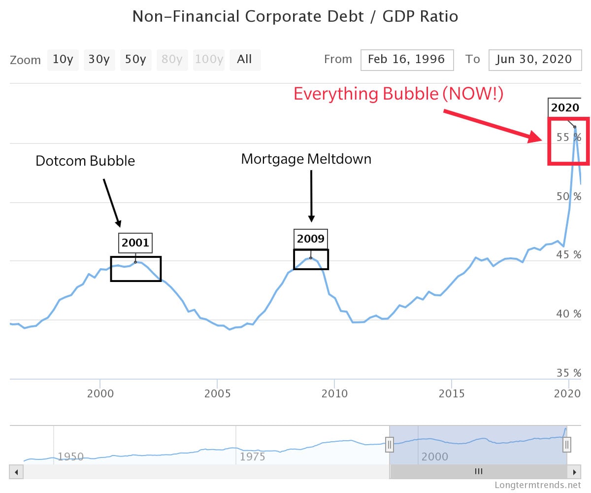
The chart below displays the record-high non-financial corporate debt-to-GDP ratios in the United States at the peaks of the financial bubbles in 2000, 2008, and 2020. Non-financial debt refers to debt held by any person or entity that is not a financial institution. Types of non-financial debt include industrial, commercial, and credit card debt held by private or public companies in any sector for expansion or individual for growth and consumption.[4] Non-financial debt includes loans that are required to be paid back in the short and long-term. Gross domestic product is the total value of goods and services produced by a country in one year. The chart below graphs the ratio between debt to the total value of goods in services (GDP). At the height of the Dotcom Bubble, this ratio hovered at 45% and briefly pierced above 45% during the Mortgage Meltdown. As of 2020, the ratio sits above 50%, indicating the amount of debt to GDP is increasing. A high percentage debt-to-GDP ratio indicates there is a higher amount of debt relative to the country’s overall earnings. To compare the Snowpocalypse with the impending Stockpocalypse, 30-year record low temperatures in Austin would be synonymous with record high debt-to-GDP ratios i.e., a looming issue that will eventually become a huge problem.
Let It Snow
Once below freezing temperatures befell Austin, Texas, it was not long before the level of precipitation rose, causing snow to fall and the fragile electrical grid to seize up sparking a statewide outage. From ‘Snow’ to ‘Stock,’ the level of precipitation would run synonymously with the level of interest rates in this comparison. As the level of interest rates rise, bond prices drop, debt payments increase as well as the potential for defaults and stock bankruptcies. In stock valuation, interest rates are inputs in discounted cash flow equations which are used to calculate a stock’s theoretical value. If the analyst’s calculation is higher than the stock’s current market price, the analyst may buy the stock considering the stock may potentially be undervalued and vice versa. A hypothetical example of a discounted cash flow equation such as a dividend discount model is provided below to highlight how an increase in interest rates with no changes in growth rate may affect stock valuations:
Dividend Discount Model:
Analyst’s Stock Price = (Next Year’s Dividend) ÷ (10-year Interest Rate – Growth Rate of Dividend)
Inputs: ABC Stock
Market Price: $40
Next Year’s Estimated Annual Dividend: $1.00
10-year Interest Rate (US 10T): 4.00%
Estimated Annual Growth Rate of Dividend: 2.00% (stays the same)
Below are calculated stock prices as interest rates begin to rise:
Analyst’s stock price when 10-year rate is at 4.00% = $50
Analyst’s stock price when 10-year rate is at 5.00% = $33.33
Analyst’s stock price when 10-year rate is at 6.00% = $25
From Snowball to Curveball
Issued debt is due back or matures at different time frames at varying interest rates. Companies can decide to take out a loan that is due back in 3 months or a loan that is due in 30 years. Professional money managers look at the shape of the yield curve rather than searching for each interest rate or yield at each maturity to determine the general direction of where interest rates may go. The yield curve is a graph that plots interest rates at different maturities. One of the single most effective early indicators of a recession has been the inversion of the yield curve.[5] “The gap between three-month and 10-year yields is closely watched. An inversion, when 10-year yields fall below those on three-month bills, has in the past been a reliable indicator that a recession will follow in one to two years. This part of the yield curve inverted in March 2019 for the first time since the 2007-2009 financial crisis”.[6] The yield curve steepened dramatically causing the bursting of the 2000 and 2008 bubble. A steepening yield curve means the interest rates on the “long end” or furthest out maturities increase faster than shorter-term maturities. A comparison of the increasing precipitation in Austin resulting in snowfall would be equivalent to the steepening of the yield curve i.e., increasing debt payments resulting in lower valuations and falling stock and bond prices.
“Volatility is the brother of Credit.”
-Christopher R. Cole, CFA, Artemis Capital CEO/CIO
Volatility refers to the dispersion of potential stock prices. When interest rates are low, companies are likely to finance its operations with debt, meaning stock volatility will be low and the dispersion of stock prices will be small. However, when interest rates increase, business operations are unlikely to be undertaken as uncertainty sets in about the future growth prospects resulting in higher stock volatility and a higher dispersion of stock prices.[7] As a result, the potential outcomes for stock prices widens. One of the best correlations to implied volatility is the yield curve.[8] The direction of implied volatility is dictated by the steepness of the yield curve. The more the yield curve steepens, the higher implied volatility will rise.[9]
Lights Out
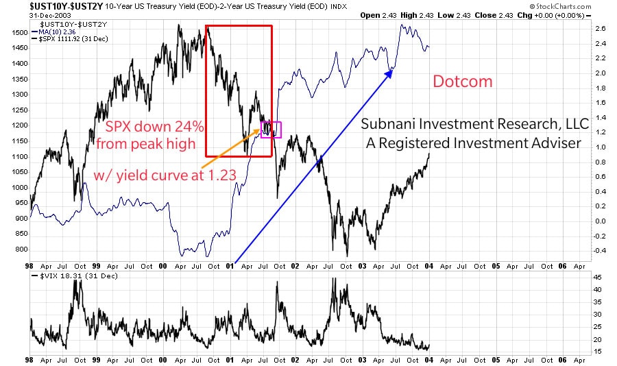
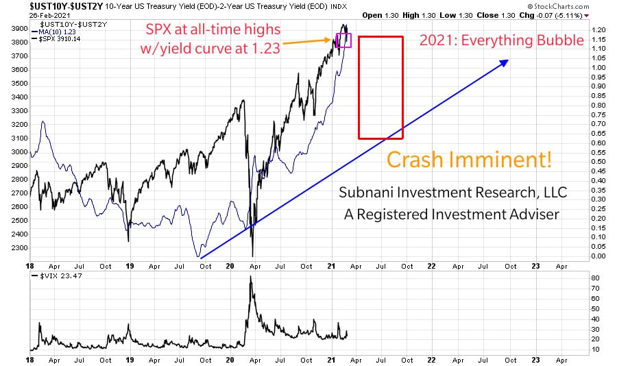
As mentioned above, the inversion then steepening of the yield curve sparked a stock market selloff in 2000 and 2008. Charts of the yield curve in 2021, 2008 and 2000 are provided below. To understand the stock market’s reaction to a steepening yield curve, the S&P 500 market price is overlaid onto the same chart. In the chart below, the yield curve is expressed as the difference between the 10-year and 2-year US Treasury interest rates. The blue line is a 10-day moving average of the yield curve to quantify the steepness into a simple number. The black line is the price of the S&P 500. The blue arrow highlights the steepening of the yield curve. As of February 24, 2021, the moving average of the yield curve equaled 1.23. In order to gauge the market’s reaction, or in our comparison, if the electrical grid has failed or not, a lookback at when the yield curve moving average equaled 1.23 during 2000 and 2008 would result in the answer.
In the chart below titled Dotcom, the yield curve moving average of 1.23 is boxed in pink. The electrical grid failure percentage, or stock market’s reaction was a 24% drop from its peak high and is boxed in red. The further steepening of the yield curve or subsequent rise in the moving average resulted in a further drop in stock prices. Investors who had not “winterized” or hedged their investment portfolios against a market drop suffered major losses.
In the chart below titled Mortgage Bubble, the yield curve moving average of 1.23 is boxed in pink. Subsequently, the stock market was down 15% from its peak high. The realization that the electrical grid had failed entirely set in towards the end of 2008 as the yield curve further steepened and the S&P 500 continued its decline.

In the final chart titled 2021: Everything Bubble, the yield curve moving average equaled 1.23 on February 26, 2021 and is boxed in pink. However, the S&P 500 traded at an all-time high of $3,950.43 on February 16, 2021. Subnani Investment Research, LLC asserts that snow is falling and that the electrical grid is about to fail. The firm believes the S&P 500 is vastly overdue for a minimum 15-25% correction. The firm also believes the stock market will experience downward trending prices until the yield curve moving average tops in value, potentially in 2022 or 2023.
‘Unwinterized’ Investing
During Dotcom and 2008 investors increased their stock exposures as stock prices rose. Investors began using “margin” or leverage to magnify their gains, consequently being exposed to greater potential losses as well. The chart below displays the amount of leverage (in billions) investors were using at the peaks of 2000, 2008, and currently. The red line is the amount of leverage used. The blue line is the S&P 500 price. As the market price started to increase, the amount of leverage started to increase as well. Investors began to increase risk as the price went higher. However, when the S&P 500 began to decline, investors who were overleveraged had to sell their investments, further exacerbating the decline in stock prices. The amount of margin debt used in 2020 is 1.5x more than in 2008 and over 2x more than in 2000.

To highlight the divergence in price and leverage, an inverted chart of the same data is provided below. The firm believes the unwind or decline in margin debt will further exacerbate the decline in the S&P 500.

Subnani Investment Research, LLC asserts investors are “sitting in the dark” without realizing the power is out. The firm believes investors may experience unrealized losses as the yield curve further steepens causing implied volatility to rise and stock prices to fall. Subnani Investment Research, LLC is hedging or ‘winterizing’ clients’ investment portfolios. To learn more or to become a client, contact Sanju Subnani at ssubnani@sinvestsllc.com.
References:
[1] https://www.kvue.com/article/weather/forecast/coldest-weather-in-over-30-years-possible-for-central-texas/269-9c8b20c4-feb5-4a00-9802-2c057445fdf8
[2] https://www.statesman.com/story/news/2021/02/15/texas-winter-storm-how-austin-energy-picks-areas-rolling-blackouts/6747569002/
[3] https://www.vox.com/the-goods/2021/2/18/22289892/texas-hotel-booking-prices-storm
[4] https://data.oecd.org/corporate/non-financial-corporations-debt-to-surplus-ratio.htm
[5] Bassman, Harley. “Seeking Treasure with Convexity.” The Convexity Maven, 23 Feb. 2021, www.convexitymaven.com/images/Convexity_Maven_-_Seeking_Treasure_with_Convexity.pdf.
[6] https://www.reuters.com/article/us-usa-economy-yieldcurve-explainer/countdown-to-recession-what-an-inverted-yield-curve-means-idUSKBN1ZR2EX
[7] Cole, Christopher R., CFA “Volatility and the Alchemy of Risk: Reflexivity in the Shadows of Black Monday 1987.” Artemis Capital Management L.P., Oct. 2017, static1.squarespace.com/static/5581f17ee4b01f59c2b1513a/t/59ea16dbbe42d6ff1cae589f/1508513505640/Artemis_Volatility+and+the+Alchemy+of+Risk_2017.pdf.
[8] Bassman, Harley. “Seeking Treasure with Convexity.” The Convexity Maven, 23 Feb. 2021, www.convexitymaven.com/images/Convexity_Maven_-_Seeking_Treasure_with_Convexity.pdf.
[9] Crossmark Global Investments. “The Yield Curve and Its 3 Key Risks: Duration, Volatility, and Credit.” Crossmarkglobal.com, 2018, www.crossmarkglobal.com/wp-content/uploads/Yield-Curve-white-paper-Nov-2018.pdf.